Timeline
The design of this site over the years
Welcome to the visual scrapbook of my little corner of the web. Like many who love to write and tinker on the internet, my website has been my digital living room, laboratory, and notebook since the domain was first registered on 1 December 2009 (thank you sis and Adam!)
Over the years, it has transformed right alongside my life: from an early twenty-something’s blogging experiment to a hub for books and coaching, and now a quiet, distraction-free space for essays and psychology studies.
Here is the story of how this site has looked, felt, and worked over the years.
History
Built with Bear Blog
2024—Now
Stripped away all the machinery of WordPress in favour of Bear Blog. Zero tracking scripts, no heavy database queries, just raw Markdown files, clean typography, and pages that load in the blink of an eye.
Built with WordPress (Block Themes & Modern Era)
2022—2024
Embraced modern Full Site Editing with Brian Gardner’s Frost WP and block-based experiments. Inspired by the playful, pastel aesthetic of studios like Oak.is, mixing colourful full-bleed background tints with sharp geometric typography like Figtree and Inter.
Built with WordPress & Genesis (StudioPress)
2012—2021
A nearly decade-long golden era powered by StudioPress themes on the Genesis framework (Academy Pro, Authority Pro, Parallax Pro, Balance, and Prose). A warm, editorial home for deep longform essays, newsletter growth, and literary serif type.
Built with Classic WordPress
2010—2012
The very beginning. Hosted on standard shared hosting using the classic literary theme The Erudite. Warm sepia tones, traditional bookish typography, and the excitement of hitting "Publish" for the first time in July 2010.
Now
In early summer 2024 (around June/July), after fourteen years on WordPress, I packed my digital bags and moved everything to Bear Blog.
Running WordPress for over a decade was wonderful—it taught me how the web works and gave me an incredible playground to try out new themes every few years. But as time went on, I found myself spending more time updating plugins, tuning caching rules, and worrying about site speed than actually writing.
Bear Blog brought back the pure, uncomplicated joy of blogging. Everything is written in plain Markdown. There are no sidebars, no popups, and no clutter. It feels like opening a crisp, blank notebook with a favourite pen. Right now, I am pairing that simplicity with a monospaced font aesthetic, writing about psychology, books, and whatever catches my curiosity.
Yearly Archive
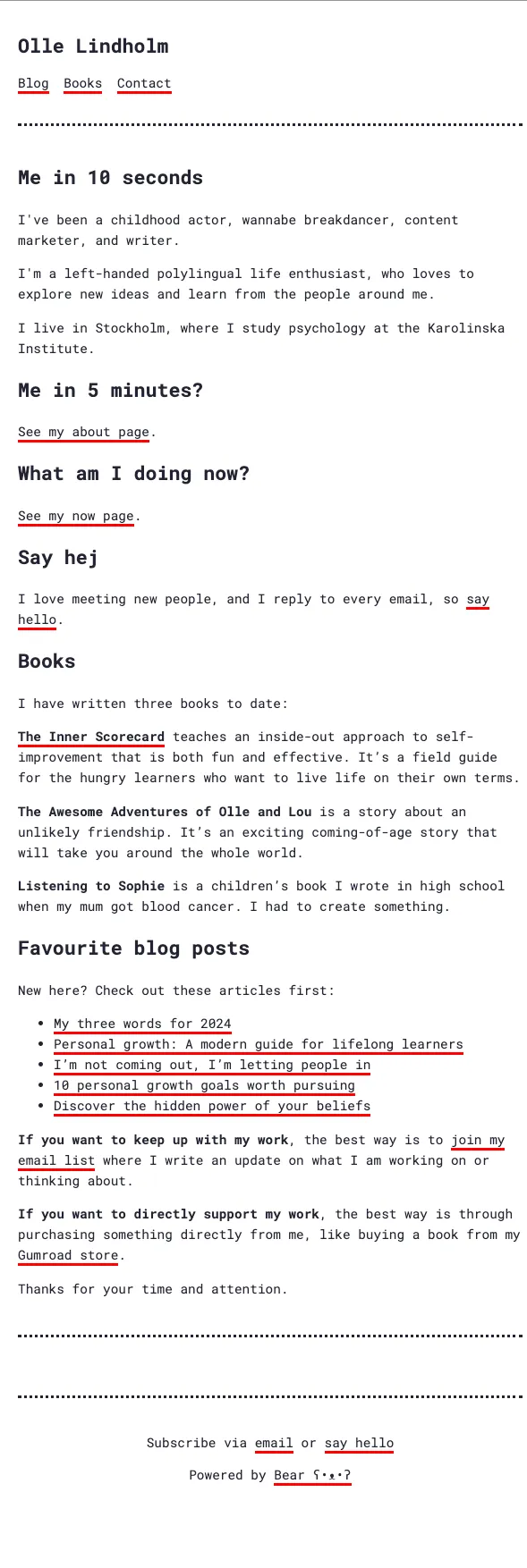
2024—Present: The Bear Blog Chapter 🐻
“Words first, everything else second.”
- The Setup: Bear Blog
- The Look: Pure, distraction-free minimalism. The layout sits comfortably at a compact 720px reading width, surrounded by generous breathing room.
- Typography: I leaned into the tactile, typewriter feel of Roboto Mono and clean monospaced stacks (
font-family: 'Roboto Mono', monospace). It gives the text an honest, work-in-progress draft quality that makes writing feel less precious and more fun. - Palette: Ultra-crisp white background (
#ffffff) paired with a softer dark-charcoal ink (#232333) instead of harsh pure black. - The Vibe: Introduced my "Me in 10 seconds" philosophy, focusing on personal reflections, my journey as a psychology student, master’s thesis thoughts, and book recommendations.
Peek at the 2025 Snapshot:
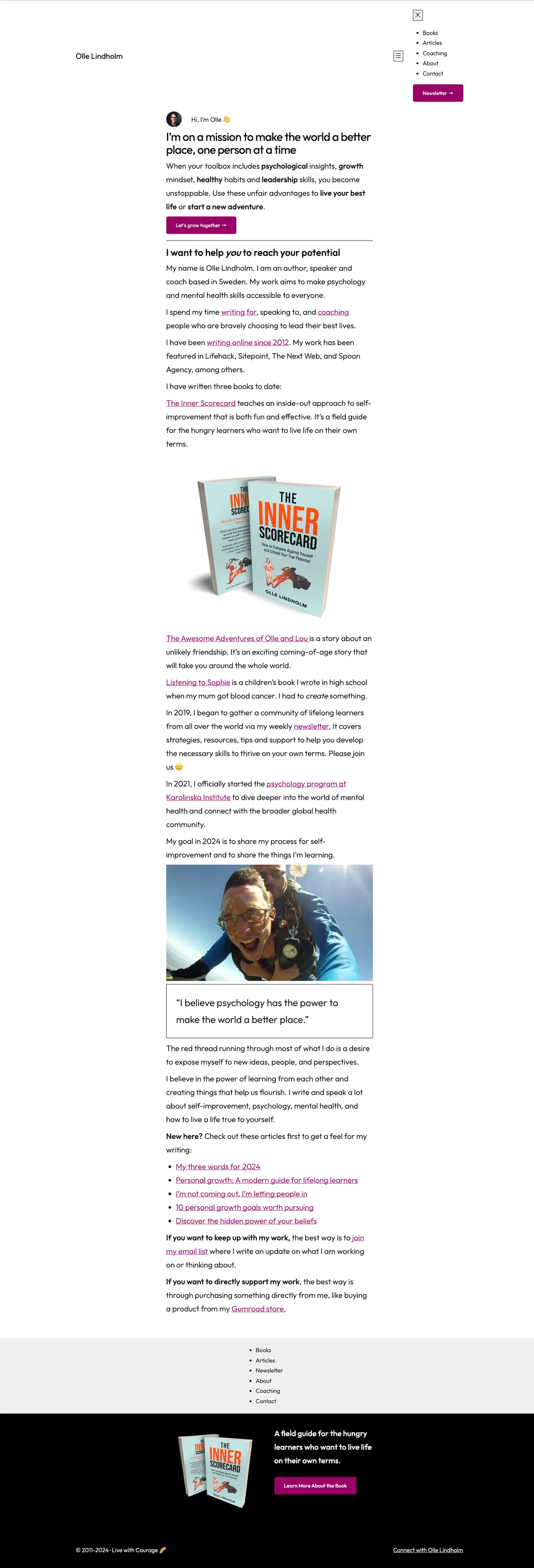
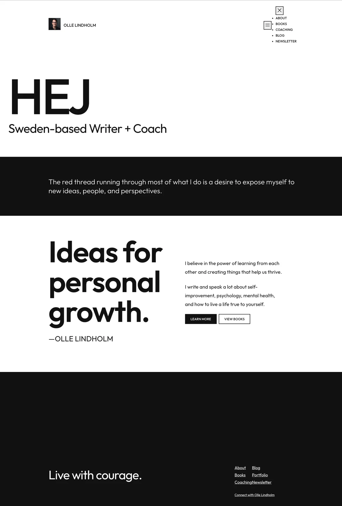
2022—2024: The Block Theme & "Oak.is" Renaissance
“Pastel canvases, block patterns, and design studio flair.”
- The Setup: WordPress Full Site Editing (FSE) using Brian Gardner’s Frost WP alongside custom block experiments (like Avant-Garde).
- The Inspiration: During this time, I fell head over heels for the website of Oak Studios (oak.is). I loved how they balanced clean Swiss design with warm personality—using colourful full-bleed background cards, subtle borders, and playful micro-typography.
- The Look & Colours: I played with different page background tints—soft warm greys, gentle creams, and pastel section blocks that gave each part of the page its own mood without feeling loud.
- Typography: This was one of my favourite typographic eras:
- Figtree + Inter: Punchy, friendly, modern geometric headings in Figtree, anchored by the rock-solid clarity of Inter for body copy.
- Jost: For a while on early Frost, I also experimented with Jost’s light, architectural geometric lines.
- Outfit: For a while, I used Outfit on Frost. It was a delightful experiment, and it was one of my favourite fonts during this period.
- Monospace touches: Tiny uppercase labels and post dates set in
Menlo / Monaco / monospacefor that handcrafted design-notebook touch.
- Monospace touches: Tiny uppercase labels and post dates set in
Peek at the 2024 snapshot:
Peek at the 2023 Block Snapshot:
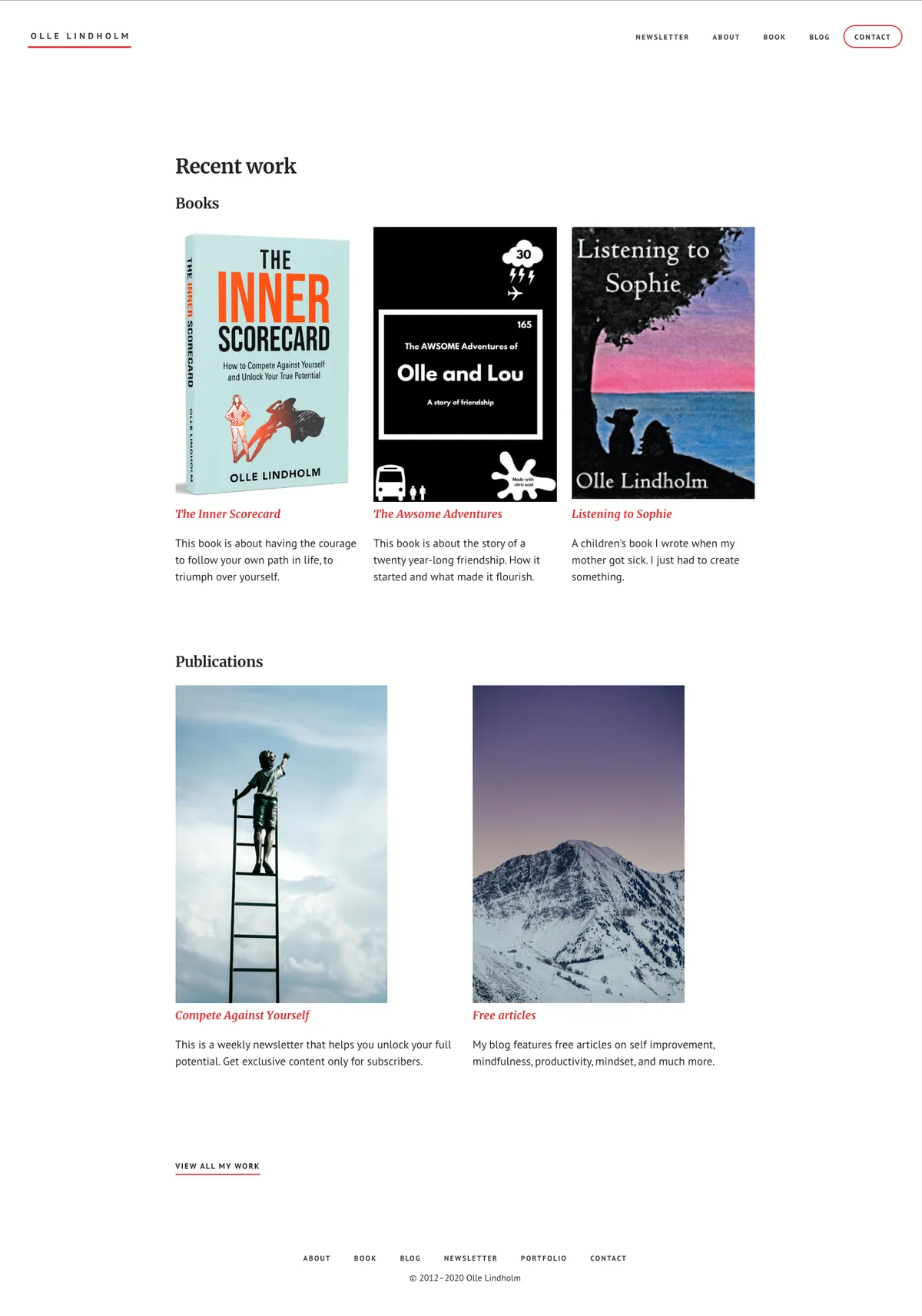
2020—2021: The Academy Era
“Courses, bookshelves, and organised clarity.”
- The Setup: StudioPress Academy Pro on Genesis.
- The Look: A structured, welcoming home built around coaching, learning, and book projects. Clean white cards, a welcoming banner introduction, and dedicated spaces to showcase what I was working on.
- Typography: PT Sans for clean, legible menus and headings, combined with Merriweather for rich, cosy longform reading.
- Palette: Deep navy blues, subtle cool greys, and crisp white page containers.
Peek at the 2020 Academy Pro Snapshot
2018—2019: The Authority & Longform Magazine Era
“Warm book paper, big headlines, and Saturday morning reading.”
- The Setup: StudioPress Authority Pro on Genesis.
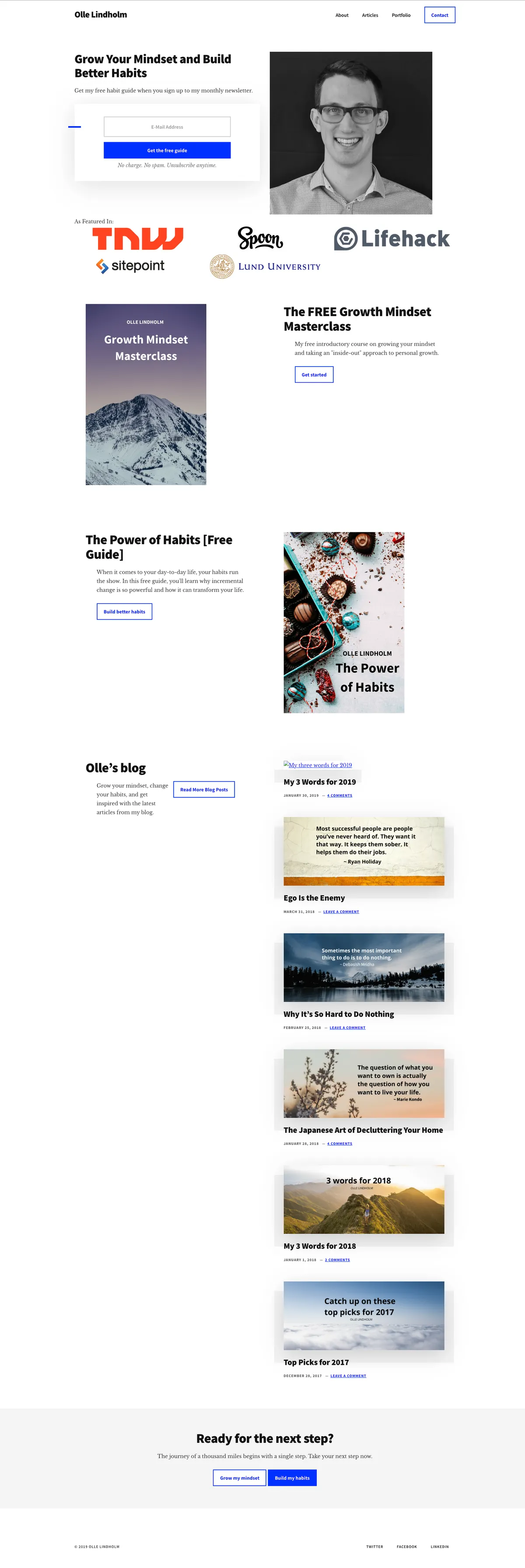
- The Look: Full-on editorial magazine feel. Big, confident lead-ins, high-quality portrait imagery, a subtle top announcement bar, and a welcoming newsletter signup box right at the hearth of the homepage.
- Typography:
- Headings: Heavyweight Source Sans Pro (weights 600 through 900) for confident, modern headlines.
- Body: Libre Baskerville, one of the warmest, most handsome digital serifs around. Reading on this site felt like turning the pages of an old favourite book.
- Palette: Warm paper tints and creamy whites with understated amber/gold accents.
Peek at the 2019 Authority Pro Snapshot
2014—2017: The Storyteller & Parallax Years
“Big photographs, bold statements, and taking the road less travelled.”
- The Setup: StudioPress Parallax Pro on Genesis.
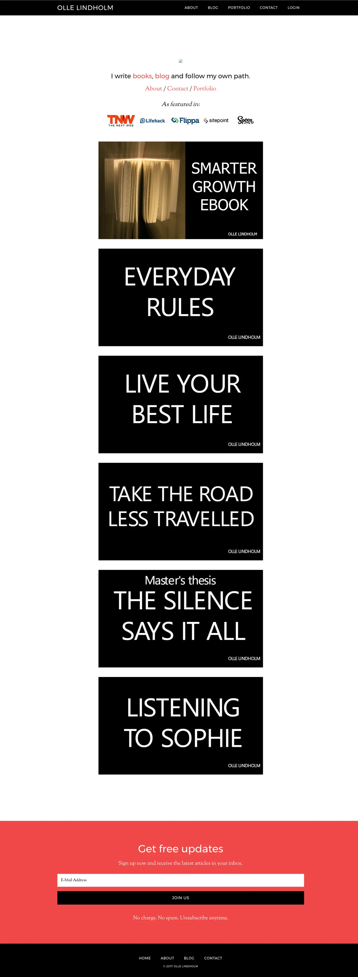
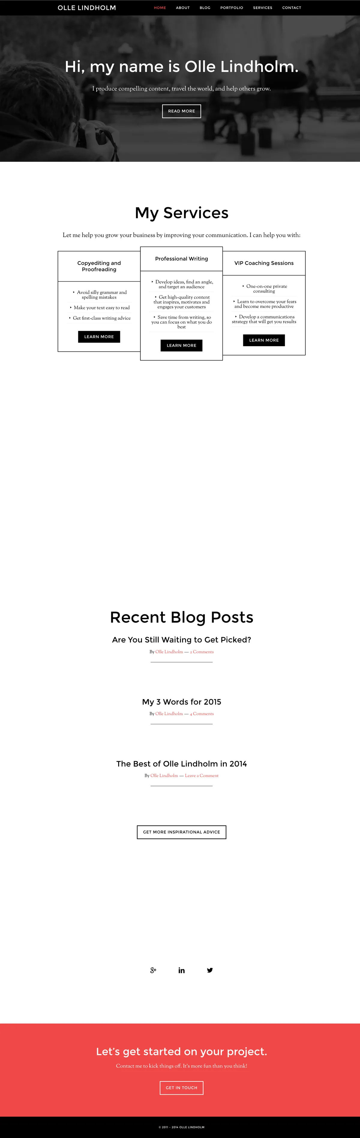
- The Look: Cinematic and bold. Full-screen photographic bands separated different chapters of the homepage, scrolling with a subtle parallax effect behind personal manifestos, coaching offers, and travel stories.
- Typography:
- Headings: Crisp uppercase Montserrat with generous letter spacing, giving it a modern editorial magazine punch.
- Body: Sorts Mill Goudy, Frederic Goudy's timeless classic serif that gave personal essays an intimate, thoughtful feel.
- Taglines through these years:
- 2014: "Writer, Translator and Personal Coach"
- 2015: "Writer, Content Strategist and Life Enthusiast"
- 2016–2017: "Take the Road Less Travelled"
Peek at the 2017 Parallax Snapshot
Peek at the 2015 Parallax Snapshot
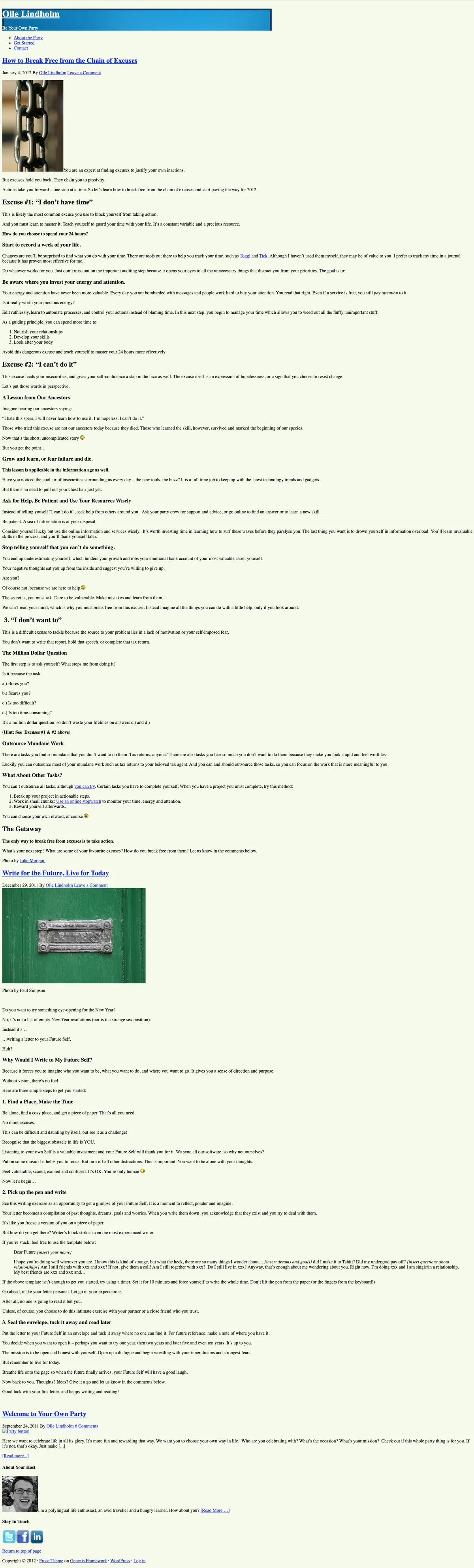
2012—2013: The Early Genesis Days (Prose & Balance)
“Finding my footing, breaking out of the cubicle.”
- The Setup: StudioPress Balance (2013) and Prose (2012).
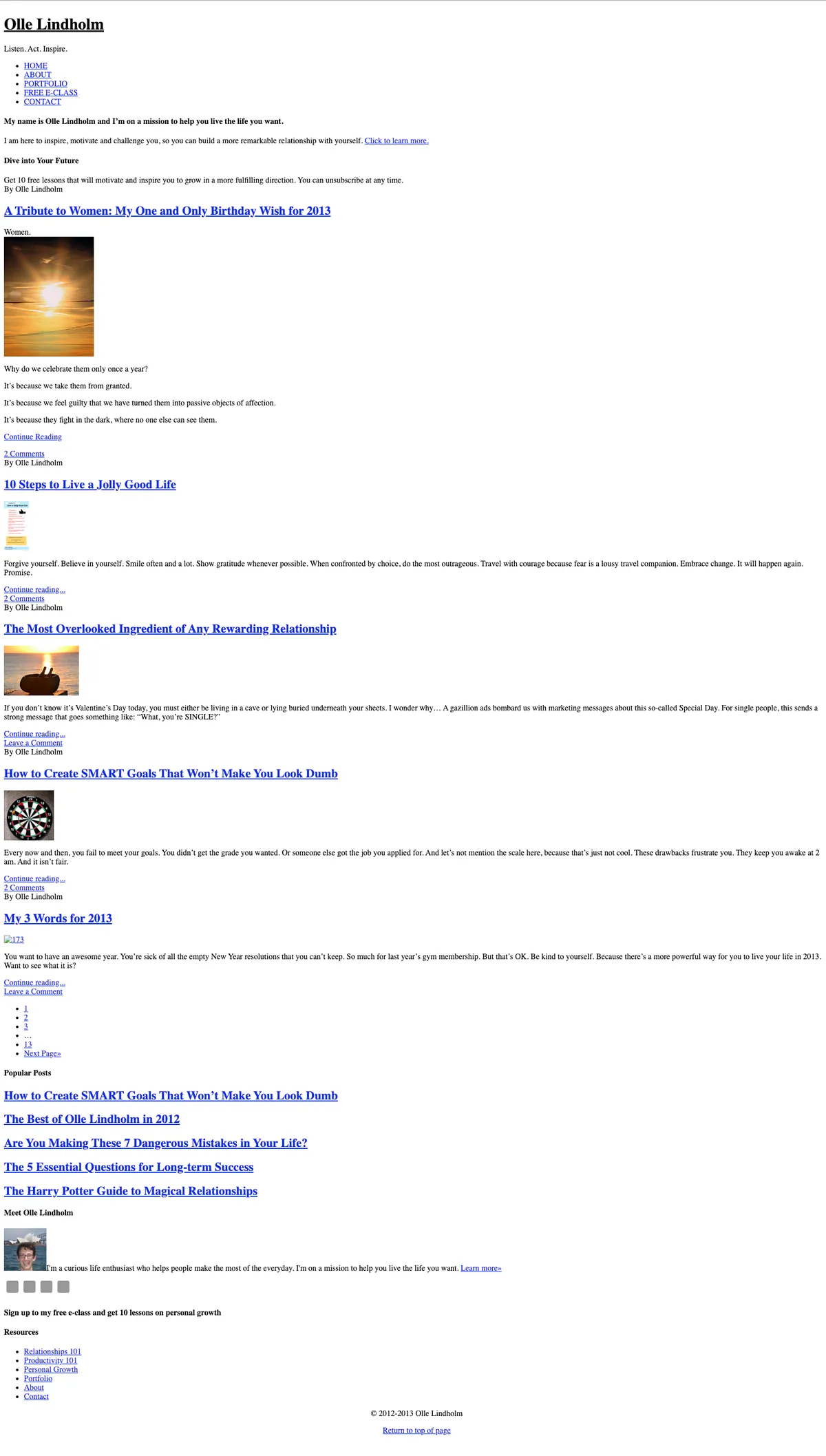
- The Look: Clean, uncluttered, classic personal blogging. In 2012 under the banner "Be Your Own Party", it featured wide margins, generous line spacing, and centred typography focused entirely on personal freedom and life experiments. By 2013, with the theme Balance, it evolved into a neat split layout featuring my portfolio, writing, and early e-courses under the motto "Listen. Act. Inspire."
- Typography: Honest, web-safe typography: classic Georgia and Helvetica/Arial with punchy blue-accent links.
Peek at the 2013 Balance Snapshot
Peek at the 2012 Prose Snapshot
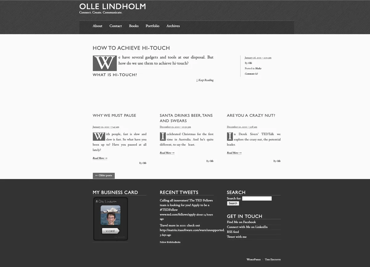
2010—2011: Day One (The Erudite)
“Connect. Create. Communicate.”
- The Setup: WordPress with Matt Thomas’s literary classic, The Erudite.
- The Look: Inspired by traditional letterpress and book design. It featured a dark charcoal header, sepia-toned paper accents, delicate hairline dividers, and vintage drop caps.
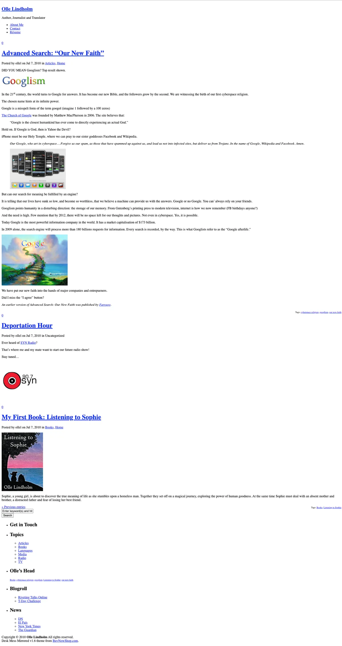
- The First Publications: The site's first recorded post went live on 7 July 2010, titled "Welcome to Olle Lindholm’s Official Website", followed just minutes later by an introductory post about my first book project, "My First Book: Listening to Sophie".
- The Spirit: The earliest posts, full of youthful excitement about ideas, reading, and connecting with people across the internet.
Peek at the 2011 The Erudite Snapshot
The first capture <3
And here comes the very first web capture of my site.. It captures the initial batch of posts I published on 7 July 2010:
Acknowledgements & Inspiration
This page was directly inspired by Paul Stamatiou’s timeline—both in spirit and format. Thank you for sharing all the design experiments you've made over the years.
A special thank you to Brian Gardner and Rafał Tomal, whose craft, themes, and design philosophy shaped so many iterations of this site across the WordPress years. You've been so generous with sharing your talents with the rest of us.
I must include and thank information architect Abby Covert, whose focus on accessibility and function served as useful reminders for my web development.
Derek Sivers, Steph Ango and Colin Wright have inspired me with their simple, playful and beautiful design aesthetic. Dead Simple Sites is a website gallery that I keep going back to for inspiration. Their designs have influenced my design decisions, especially in later years (2024-now).
This piece was researched with the help of Lovable AI, which made it possible to hunt down all those design changes over the years. I make a promise to myself that I'll do better from now on. It is important to document my own little corner of the web.